Paint: Mastering the Basics, Understanding its Power
With enough influence to change one’s outlook, and to transform a room without changing a single other thing, paint wields power surprisingly inexpensively and faster than other design tools. Paint is also the design element about which I am asked the most questions, more than all other topics. What’s the common thread? Simply put, there is so much insecurity and overwhelm about simply choosing a color you’ll love. Today I encourage you to put the overwhelm aside, and instead, let’s discuss some best practices for selecting a paint color.
Just how does a designer pick a color? To us, a fan deck is all possibility, but for our readers, it’s mostly anxiety. To get to the right color, simply ask the right
3 questions:
“What do you want to see?”
I first ask this because the primary part to that answer is whether I want my eye to stay in the space or expand out to adjacent areas – even out the window. Color is a tool, and your eye will read a room based on all its’ design and architectural elements combined, not just color- though paint color is one of the more important elements. If you want your eye to stay in the room, you’ll use color to define the space and hold your attention. If you want the eye to look beyond, you’ll choose a color that either frames the architectural transition, beckoning one to look to the next area, or one that plays second fiddle to the destination.
“Do you want the room to feel more expansive, or more intimate?”
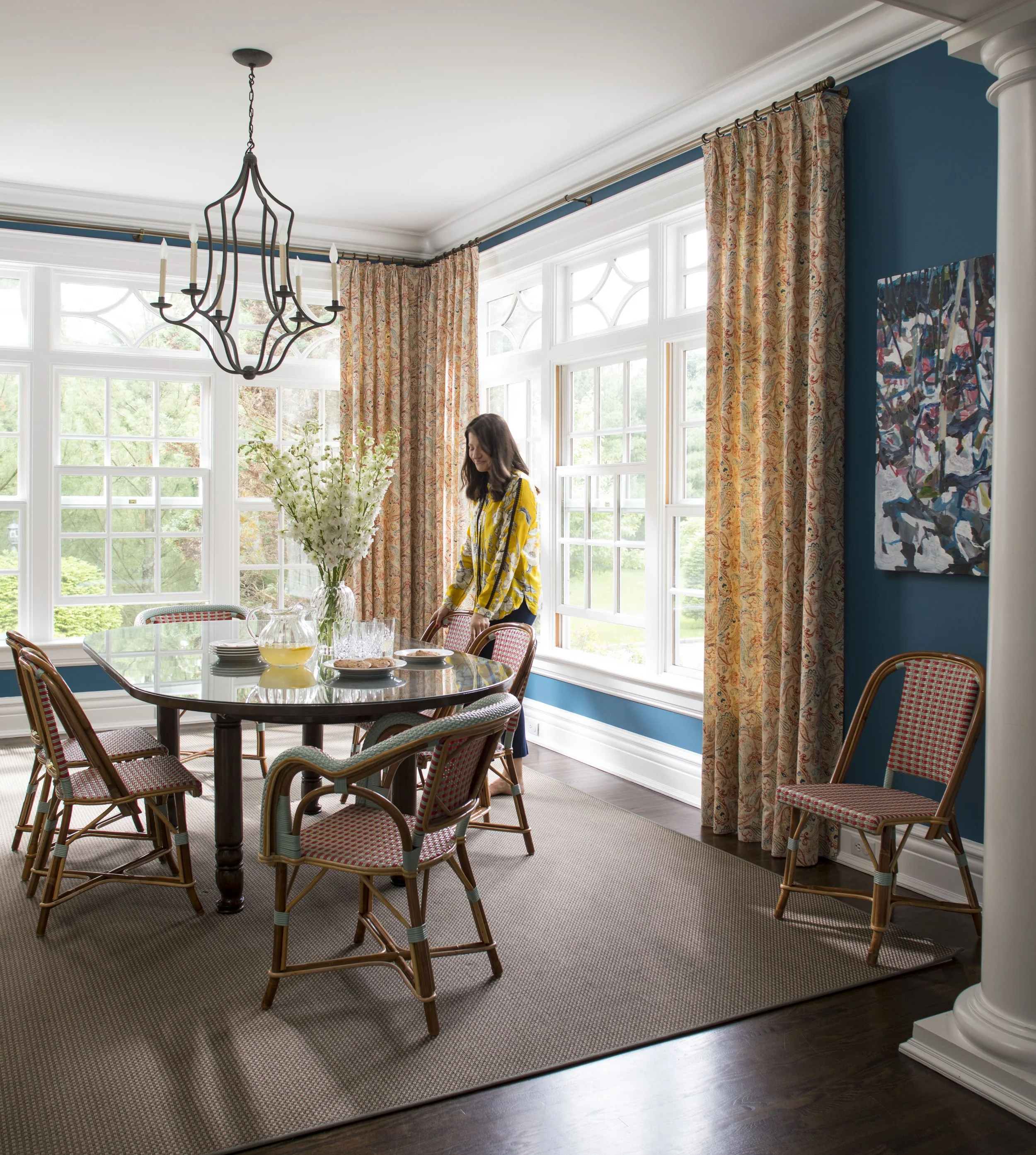
When we want to expand the perceived size of a room, I first look at the upholstered or painted furnishings at the perimeter and select a color that relates to, or is a few shades off from, the most major furniture pieces in the room. Another tactic is to choose a color that could appear outside, especially when we have the benefit of dominant windows. When the wall and the furniture, or the wall and the view, don’t contrast too much, your eye will naturally start to “push” furnishings to become part of the “envelope” of the room. If my eye can register, but skim across most of the furniture, it’s all becoming less dominant.
Now, the real story is that it doesn’t really matter whether the overall envelope tone is white, black or a color between, in fact, darker colors recede more than lighter ones though lighter colors bounce light around more. I prefer a different way to think this through. What matters is that I focus the eye and the brain. To do this, I use furnishing finishes with a stronger contrast in the center of the room, or on select pieces to highlight some design element; I am creating a focus with color and finish. When my room “feels” calmer and organized, more focused on fewer, but nicer elements, my mind feels the room as more “expansive”.
With the opposite issue, larger rooms can often seem lost, often with too much stuff, or not enough to tie it all together. Again, all the elements of a room need to work together but paint color is one very important tool. Designers often will use color to help define spaces within the room, breaking the expansive space down into cozier or more function-focused areas. Designers will use a dominant color to envelop the room, allowing the design of smaller areas and groupings to react differently against the color, creating hierarchy.
Got a very open space? Identify the more dominant walls within the room and use color to bring more attention and definition to them. If a room in your home appears to be “floating”, it is likely because it lacks a strong anchor. In cases where architecture alone doesn’t direct the room, color can be a great next option.
“How do you want the room to feel?”
This one is all about gut reactions- some colors just feel right, so listen carefully while you look. On an introductory level, pull a color out of a rug, a dominant piece of art, the upholstery on the biggest piece of furniture in the room etc., and highlight it by picking a color a few shades off. Or, look at a dominant color in your furnishings and turn to the complimentary color on your color wheel (in some art class you reviewed this once) to pick a few tones.
For advanced readers, you can pick a color that doesn’t appear in any fabric or rug in the room- but it must be the maverick that can magically compliment it all and be brilliant on its’ own. If you hit that- send me a pic and we’ll raise a toast to you!
A few common asks:
Calm color: pick a color that makes all the upholstered furnishings feel calm- even if it’s a color that’s darker/more dominant than all else (try Farrow and Ball ).
Vibrant color: Remember it’s got to be a color that yes, has more pigment and saturation (C2 Paints and Benjamin Moore Century Paint are good options here), but it needs to sit at almost the same level of vibrancy as the upholstery in the room so as not to make all else dull. Colorful without looking like a kids’ room: Stay away from the brighter, clearer colors and instead pick a color you like with an undertone of something else in it to give it a mature complexity (Benjamin Moore “Color Stories” line is a good example.)
Ten Paint selection and implementation tips for more know-how, less overwhelm:
1) Finishes: It can be simple
Walls: Washable Matte or Flat- and choose a brand that allows touch ups without needing to re-do the whole wall. Faves include Benjamin Moore and Sherwin Williams.
Trim: Our everyday go-to is Water-based Satin’s elegant sheen with durability. Have brand new or gorgeously restored trim? Show it off with Semi-Gloss.
Ceilings: Always Flat unless we have a highlight in mind. Bathrooms get Eggshell.
Kitchen Walls and Bath Walls: Eggshell for durability and moisture resistance.
Entrance Doors: We love a Semi-Gloss or Full Gloss! Satin for more casual or rustic homes.
2) Specialty finish: Prep first
Pristine walls are a must, the glossier the paint, the more pronounced the blemish
Budget and plan accordingly for any sanding, priming, and other rehab the wall may need
3) Cabinetry: Consider color!
Light, purer color: Bounces light around a room while adding a lift
Muted Color: Add opinion without a scream
Bold Color: Interject a room with energy
Darker, saturated color: Gives a room a hug, even an edge
White: The perfect white can be quietly beautiful, and can also allow focus elsewhere
Satin Finish: elegant durability
Semi-Gloss Finish: Attention seeking
Full Gloss: Attention grabbing
Milk paint/Matte: Country-casual, city-cool
Tip: Backs of open shelves look amazing in a contrast color or finish
4) Bathroom colors: Good morning, good night
Paler, nuanced color: Pick one with a drop of opinion, to keep it from feeling so sterile. Lighter tones bounce light and provide more neutral backdrop when applying makeup while at a vanity.
Intense color: Save it for a toilet room, the backs of open shelves, powder room or mudroom bath.
Bathrooms have moisture: Pick the right finish! Eggshell usually is perfect.
5) Glam Factor: Semi and High-Gloss
Think architecture for higher gloss paints: Highlight key architectural elements or accentuate a particular piece of furniture. Be sure your surface is in prime condition- this is an absolute necessity.
Entrance doors announced in a brighter gloss immediately reveal how much you care for your home…and how good the painter is that you hired. Once you opt for a higher gloss here, embrace it! Take care of the finish though, it’s beautiful and beams a “welcome”, but must be maintained.
6) Ceilings: Look up! Yes, DO use a color on the 5th wall
Ceilings are a forgotten plane when it comes to paint, but don’t be afraid. With low ceilings, take the wall color and go a few shades off to use on the trim, and lighten up a little more on the ceiling; and your eye will naturally go up and across the room. Higher ceilings can take more drama or contrast.
Consider using a lux finish like a pearlescent or metallic. (Our faves include Benjamin Moore studio finishes applied to any color.) The soft sheen is so chic and as a bonus, a ceiling is the one place that is seriously hard for kids and pets to mess up a special finish.
7) Front Door: Bring the inside, outdoors
An especially good tip for freestanding or semi-attached homes, but also a good idea for full floor apartments, painting the front door adds personality and provides a clue as to what is inside.
Before renovating all else, painting a front door is an easy and fast way to emotionally attach to a new home you’ve purchased, and make it yours.
Fave Colors: A luxe black paint adds glam, blue for a coastal home is pretty, deep rust or ochre can look amazing amidst deep wooded areas. Limestone and brick townhouses can get away with pops of unexpected brighter tones. My favorite 2 doors I ever painted are orange and red, as they are so welcoming and happy.
8) Unify the home: Choose a color palette for the whole house
Start by walking through the house and identifying key areas, walls, furniture and other features you want to accentuate with color.
Consider the colors that already exist throughout the home. What would complement and enhance those well?
Overwhelmed? Narrow down to one or two colors to carry in small and bigger ways through a home, establishing a theme. Now add other colors in individual rooms and remember, the only rule is that the base colors show up somehow (think upholstery, accent furniture, accessories) and all other colors need to work well with that base couple of colors.
9) Test First: NEVER skip this step
Be sure to always test the paint before putting it on the walls. Use a piece of foam core and paint in the finish you want, leave it up, move it around and live with it.
Test at least 2 more shades of the color to give yourself some options, and ideas on what to expect for the outcome.
10) Hire a pro: Do it once, do it right
Look for someone with solid experience and someone with a team. One person should not be hired for more than one room, one client at a time.
Quality painters are always in high demand! Make calls early, book ahead and plan well in advance. Contact us for our NYC area faves.
NEVER rush painters through a project. You want the final product to delight and impress; allowing the right amount of time is critical.
I believe paint ties a home together, no matter the size, and is a tool to be used to your advantage. Get it right and you’ll look back and wonder what seemed so daunting. That said, if you need help and simply don’t want to go at this alone, yes, we will take on whole-house color selection projects. Be sure to write to me with your success stories, or post to Instagram and hashtag it #kathleendwalsh. I always love hearing about your wins and successes!